What is CSS?
CSS is used to control how a website looks, including colours, fonts, spacing, layout, and responsive design across different screen sizes.
CSS stands for Cascading Style Sheets. It’s the language that controls how a web page looks. While HTML defines the structure and content of a page, CSS defines its appearance: colours, fonts, spacing, layout, borders, animations, and how the page adapts to different screen sizes.
Without CSS, every website would look like a plain document with black text on a white background with default browser styling. CSS is what makes the web visual.
How CSS Works
CSS works by targeting HTML elements and applying style rules to them. A rule has two parts: a selector that targets an element, and a declaration block containing the styles to apply.
A simple example:
css
h1 {
  color: #143D66;
  font-size: 2rem;
  font-weight: 700;
}
This tells the browser: find every <h1> element and make the text navy, large, and bold.
Selectors can target elements in multiple ways. By element type: all <p> tags. By class: anything with class="price-badge". By ID: the element with id="main-nav". By attribute: all links with target="_blank". By position in the page: the first <li> inside a <ul>. Selectors can be combined and chained for fine-grained control.
What “Cascading” Means
The “cascading” in CSS refers to how the browser resolves conflicts when multiple rules target the same element.
Styles cascade from general to specific. A rule targeting all <p> elements is general. A rule targeting <p> elements inside a specific <div> with a particular class is more specific. When both apply to the same element, the more specific rule wins.
The cascade considers three things in order: origin (browser defaults vs author styles vs user styles), specificity (how precisely the selector targets the element), and source order (later rules override earlier ones if specificity is equal).
Understanding this is important for debugging CSS. If a style isn’t applying as expected, the cascade is usually the reason. A more specific rule somewhere else is overriding it.
Where CSS Lives
CSS can be written in three places, each with different use cases.
External stylesheets are separate .css files linked in the HTML <head>:
html
<link rel="stylesheet" href="/style.css">This is the standard approach. One stylesheet controls the appearance of the whole site. WordPress themes load their styles this way. The browser downloads the stylesheet once and caches it. Subsequent page loads use the cached version rather than downloading it again, which is a meaningful performance win.
Internal styles sit inside a <style> tag in the HTML <head>. They apply only to that page and can’t be cached separately. Used occasionally for page-specific styles or for inlining critical CSS (more on this below).
Inline styles are written directly on an HTML element using the style attribute:
html
<p style="color: red; font-weight: bold;">Warning message</p>Inline styles have the highest specificity and override everything else. They’re quick for one-off overrides but hard to maintain at scale and don’t benefit from caching.
CSS Units and Values
CSS uses several types of units for sizing and spacing.
Absolute units like px (pixels) are fixed in size regardless of context. 16px is always 16px. Good for borders and fine details where precision matters.
Relative units scale based on context. em is relative to the font size of the parent element. rem is relative to the root font size (the <html> element), making it more predictable. % is relative to the parent container’s dimension.
Viewport units scale with the browser window. vw is 1% of the viewport width. vh is 1% of the viewport height. Useful for full-screen sections or elements that should scale proportionally with the window.
For most typography and spacing in modern CSS, rem is the preferred unit. It’s predictable, respects user font size preferences, and makes scaling consistent across the site.
CSS Layout: Flexbox and Grid
Modern CSS layout is handled by two systems: Flexbox and Grid.
Flexbox is designed for one-dimensional layouts: a row of items or a column of items. It handles alignment, distribution, and spacing along a single axis. Navigation menus, button groups, card rows, and vertically centered content are natural Flexbox use cases.
css
.nav {
  display: flex;
  align-items: center;
  gap: 1.5rem;
}
CSS Grid handles two-dimensional layouts: rows and columns simultaneously. It’s the right tool for page-level layouts, complex content grids, and any case where items need to align in both directions.
css
.pricing-grid {
  display: grid;
  grid-template-columns: repeat(3, 1fr);
  gap: 1.25rem;
}
These two systems have largely replaced older techniques like float-based layouts and CSS table hacks. Modern WordPress themes use Flexbox and Grid throughout.
Responsive Design and Media Queries
CSS includes a feature called media queries that applies different styles based on the device or screen size. This is how responsive design works.
css
.sidebar {
  display: block;
}

@media (max-width: 1024px) {
  .sidebar {
    display: none;
  }
}
This hides the sidebar on screens narrower than 1024px while keeping it visible on larger screens. The same principle applies across all responsive behaviour: font sizes, column layouts, spacing, and visibility.
The standard approach is mobile-first: write your default styles for small screens, then use media queries to add styles for larger screens. This tends to produce cleaner code and ensures mobile styles don’t have to fight against a desktop-first baseline.
CSS and Website Performance
CSS affects page speed in ways that aren’t always obvious.
Render blocking: The browser waits for CSS to finish downloading before it renders the page. A large or slow-loading stylesheet delays everything. This is why PageSpeed Insights flags “eliminate render-blocking resources” so often.
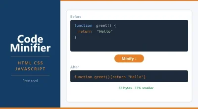
File size: Large stylesheets take longer to download. Minifying CSS removes whitespace, comments, and redundant code without changing what it does. A stylesheet that’s 100KB unminified might be 40KB minified.
Unused CSS: Many themes and page builders load CSS for features that aren’t used on a given page. Tools can identify and remove unused CSS, significantly reducing file size.
Critical CSS: The CSS needed to render the visible portion of the page without scrolling (above the fold) can be inlined directly in the HTML. This lets the browser render the top of the page immediately without waiting for an external stylesheet to download. The full stylesheet loads afterwards.
WordPress caching plugins like LiteSpeed Cache and WP Rocket handle CSS minification and critical CSS generation automatically. If your LCP score is suffering, render-blocking CSS is often a contributing factor.
CSS in WordPress
Your WordPress theme controls most of the CSS on your site. The theme’s style.css file defines the look and feel. Child themes extend a parent theme’s CSS without modifying it directly.
WordPress’s Customizer includes an Additional CSS field for small tweaks. Anything entered there is output in a <style> block in the page head. It’s fine for minor adjustments but not ideal for substantial styling work.
For more control, editing the theme’s stylesheet directly (via a child theme) or using a plugin like Code Snippets for CSS gives you full access without risk of losing changes on theme updates.
Page builders like Elementor and Bricks generate their own CSS and load it alongside the theme. This can result in large CSS payloads. Performance-conscious WordPress builds tend to minimise plugin-generated CSS through careful plugin selection and output settings.
Frequently Asked Questions
What’s the difference between CSS and HTML? HTML defines what’s on the page: headings, paragraphs, images, links. CSS defines how those things look: colour, size, spacing, layout. An HTML <h1> tag creates a heading. CSS decides its colour, font, and size. They’re separate languages that work together.
What does “cascading” mean in CSS? It refers to how conflicts between style rules are resolved. When multiple rules target the same element, the browser applies them in a specific order based on specificity and source order. More specific rules override more general ones. Rules that appear later in the stylesheet override earlier ones of equal specificity.
Do I need to know CSS to use WordPress? Not for basic use. Your theme handles CSS. But knowing basic CSS helps when you want to customise colours, fonts, or spacing beyond what the theme’s settings offer, or when you need to fix a visual issue that the Customizer can’t address.
What is CSS minification? Minification removes whitespace, line breaks, and comments from CSS files without changing what the code does. A stylesheet that’s 80KB unminified might be 30KB minified. Smaller files load faster. Most caching plugins handle minification automatically.
What’s the difference between CSS and Sass? Sass is a CSS preprocessor: a language that extends CSS with features like variables, nesting, functions, and imports. Sass files are compiled down to regular CSS before being served to the browser. Many WordPress themes are built using Sass and compiled to CSS during development. As a site owner, you never interact with Sass directly.
Meta title: What Is CSS? How Web Pages Get Their Style | TopSiteHosters Meta description: CSS controls how your website looks: colours, fonts, layout, and spacing. Here’s what it is, how it works, and why it matters for your site.
What Is CSS?
CSS stands for Cascading Style Sheets. It’s the language that controls how a web page looks. While HTML defines the structure and content of a page, CSS defines its appearance: colours, fonts, spacing, layout, and animations.
Without CSS, every website would look like a plain document with black text on a white background. CSS is what makes the web visual.
How CSS Works
CSS works by targeting HTML elements and applying style rules to them. A rule has two parts: a selector that targets an element, and declarations that define the styles to apply.
A simple example:
h1 {
  color: #143D66;
  font-size: 2rem;
  font-weight: 700;
}
This tells the browser: find every <h1> element and make the text navy, large, and bold.
CSS can target elements by their type (all <p> tags), their class (anything with class="price"), their ID, or their position in the page structure. This flexibility is what makes CSS powerful.
Where CSS Lives
CSS can be written in three places:
External stylesheet: A separate .css file linked in the HTML <head>. This is the standard approach. One stylesheet controls the appearance of the whole site. WordPress themes load their styles this way.
Internal styles: CSS written inside a <style> tag in the HTML <head>. Used occasionally for page-specific styles.
Inline styles: CSS written directly on an HTML element using the style attribute. Quick and specific, but harder to maintain at scale.
Most sites use external stylesheets. It keeps style and content separate, makes updates easier, and lets browsers cache the stylesheet so it doesn’t re-download on every page.
CSS and Website Performance
CSS files add to your page’s loading weight. Large or poorly organised stylesheets slow down rendering.
A few things that help: minifying your CSS removes whitespace and comments, reducing file size. Loading only the CSS your page actually needs (called critical CSS) means the browser can render the visible part of the page without waiting for styles it doesn’t immediately use.
WordPress caching plugins like LiteSpeed Cache and WP Rocket handle CSS minification automatically. If your PageSpeed Insights report flags “render-blocking resources,” CSS is often the culprit.
CSS and Hosting
Hosting doesn’t affect how you write CSS, but it affects how fast it loads. A fast server with Cloudflare CDN in front serves your stylesheet from an edge location near the visitor. A slow server means your stylesheet arrives late, and the browser can’t render the page until it does.
This is one reason page caching matters: cached pages often include inlined critical CSS, so the browser can start rendering immediately without waiting for an external stylesheet.
Frequently Asked Questions
What’s the difference between CSS and HTML? HTML defines what’s on the page. CSS defines how it looks. An HTML <h1> tag creates a heading. CSS decides the heading’s colour, size, and font. They work together but do separate jobs.
What does “cascading” mean in CSS? It refers to the order in which styles are applied when multiple rules target the same element. Styles cascade from general to specific. A rule applied directly to an element overrides a general rule applied to all elements of that type. Specificity and source order determine which rule wins when there’s a conflict.
Do I need to know CSS to use WordPress? Not for basic use. Your theme handles CSS. But if you want to customise colours, fonts, or spacing without a page builder, knowing basic CSS is useful. WordPress’s Customizer includes an “Additional CSS” field for small tweaks.
What is CSS minification? Minification removes spaces, line breaks, and comments from CSS files without changing what the code does. A stylesheet that’s 80KB unminified might compress to 30KB. Smaller files load faster. Most caching plugins handle this automatically.